More news
- Nigeria’s paint industry navigates regulatory changes and economic challenges amid p...
- Focus on the global coatings market: Global coatings market outlook
- Ask Joe Powder – October 2024
- Chinese paint majors look to domestic consumer sales as commercial real estate slumps
- Architectural coatings in Nepal and Bhutan

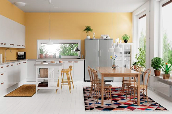
Looking forward to a year of love, joy, mindfulness and making memories. Clariant pays an advance tribute to the year to come in its new Decorative Coatings Trends for 2022 – "golden”. Launched today, consumers are invited to take inspiration for decorating their rooms, spaces and furniture from the palette’s 40 new shades that reflect 4 different phases of natural human behaviours in the new world in which we live.
"Now close to the end of another slowed-down year, we’re really craving what comes next, for the chance to move forward and re-experience life following the intense focus on our behaviours, lifestyles and desires,” commented Franziska Hammerl, Segment Head Decorative and Wood Coatings, Global Technical Marketing Coatings at Clariant.
In phase 1, "memotions”, a rather calm colour selection with some poppy colour accents represents a coming back to life of sorts, where we’re re-orienting ourselves, considering our recent pasts to plan our futures. This palette includes Color of the Year "memory gold”, an antique gold tone with just the right touch of luxury, inspiring us to create new memories distinct from the past. The shade was formulated with Clariant pigment preparations and was mixed with SHINEDECOR C393, a brand new ready-to-use gold pearlescent effect pigment concentrate for waterborne paints from Clariant’s styling partner, Eckart, to achieve the final antique and sparkling golden tone.
"Memory gold is set to be an ever-present through 2022, perfect for accenting, or for colour drenching and blocking techniques to partner other colours of the years announced by decorative coatings brands. The combination of a neutral gold shade and effect pigment brings something meaningful and special to homes and lives,” added Franziska.
From memotions we enter "wembrace”, where the colour scheme becomes more colourful while staying with calmer, naturally driven colours like greens, beiges and blues that reflect the happiness and feelings of being allowed to "breathe” again.
In "wescalate”, the palette evolves to become yet more colourful again, as we take these new opportunities into overdrive and go beyond our previous comfort zones. Blue tones continue to be dominant, but are accompanied by intense shades such as pink, orange and turquoise – ideal as accent colours to create a focal point without overwhelming the room.
Finally, within the "metox” palette you find very calm colours which are more on the cold side. Greys, blues, green and beige are the key colours that can be used for full colour schemes in our homes. Because, after all this building excitement has waned, it’s time to settle back down to who we really are.
Clariant sets new trends as one of the only pigment producers to publish colour palettes for decorative coatings, supporting DIY enthusiasts to professional decorators with trend-setting colours relevant to key application trends and design directions.
All shades in golden are formulated with Colanyl® 500 waterborne pigment preparations which enable consumers to match any colour they choose in modern architectural paints and plasters. The resin-free and low VOC range combines the advantages of broad compatibility in waterborne architectural coatings and suitability for Point-of-Sale and In-Plant tinting. Colanyl 500 is manufactured without using alkyl phenol ethoxylated additives (APEO) and meets the requirements of the official VOC test norm DIN EN ISO 11890-2 (Directive 2004/42/EC).
"golden” – Decorative Color Trends 2022 features four colour sets and month-by-month highlight shades designed to stimulate creativity, feelings, friendships, and a focus on ourselves. Explore the colour selections and special effects at clariant.com/decorativecolortrends2022.


