More news
- Focus on the global coatings market: Global coatings market outlook
- View from the UK: Navigating chemical policy and sustainability
- Focus on adhesives: Unveiling unbreakable bonds – Testing redefines physical strengt...
- Focus on adhesives: Henkel and Covestro collaborate for sustainability of engineered wood ...
- Advances in construction chemical technology: What’s new in 2024?

Colour expert Montaha Hidefi presents Color Marketing Group’s 2025 colour forecast, which spans four key geographic regions and focuses on themes of connection, sustainability and technological evolution
Each year, the Color Marketing Group™ (CMG), a premier international association for colour design professionals, convenes a global network of designers, marketers, colour scientists, consultants, educators and artists. As a not-for-profit organisation dedicated to generating accurate and relevant colour and trend forecasts, CMG cultivates collaboration through local and international forecasting events. These gatherings provide a professional platform to research, analyse and discuss the social, technological, environmental, economic and political macro trends that shape the evolution of colour, material and finish across all industries.
Central to this process are the ChromaZone® workshops, led by experienced facilitators. Participants engage in deep discussions to identify emerging colour directions for the next two years across four geographical regions.
The result of these extensive efforts, conducted during 2023’s forecasting season, is CMG’s 2025+ World Color Forecast™—the product of more than 600 hours of collective work by more than 200 participants. This forecast, a vital tool for colour decision-making since 1962, informs the future of colour and continues to guide industries worldwide.
As we look ahead, themes of connection, sustainability and technological evolution resonate across regions, shaping the hues that will define the coming years. Each region’s color direction reflects local influences and tells a unique story, presenting a distinct outlook on the future. Here, we explore CMG’s color forecast for 2025 and beyond across Asia Pacific, Europe, Latin America, and North America, uncovering the narratives that have guided these projections.
Asia Pacific – A symphony of connection
In the Asia Pacific region, the future is captured with a desire for connection — extending beyond individual awareness to embrace the collective human experience. This interconnectedness manifests in the warmth of orange and red hues, alongside enduring blue tones, celebrating inclusivity and diversity across cultures, genders and ages.
Sustainability is a cornerstone of the region’s forecast, with colours inspired by nature — particularly horticulture, agriculture and natural landscapes. These hues reflect a world where ecosystems are balanced and environmental impact is minimised through sustainable practices. The integration of reclaimed materials and plant-based bio-materials fused with technology will drive organic, biophilic, low-chroma colours that honour both the past and the future.
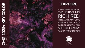
The younger generation’s interaction with the digital world, where curiosity and caution coexist, greatly influences the region’s colour direction. This is echoed in the embrace of bright, vibrant colours, where lime green symbolises digital vibrancy and a deep, near-black, red embodies the meditative state necessary for navigating a tech-driven world.
Europe – The duality of tradition and innovation
Europe’s colour forecast presents a striking duality. On one side, there is a return to deep, rich colours, nodding to tradition and resilience. On the other, there is an exploration of neutral tones, influenced by migration and cultural blending across the continent. This dichotomy reflects a trend where minimalism and sustainability take centre stage, advocating a departure from fleeting trends in favour of enduring values.
The shift toward reduced materialism and ecological responsibility is embodied in warm and cool neutrals that serve as a canvas for this minimalist ethos. The influence of global migration introduces new colours, inspired by the Middle East, Latin America and Africa, adding warmth and depth to the European forecast.
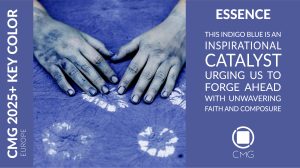
Europe’s forecast also explores the intersection of online inequalities and the influence of big tech, giving rise to shades that are both introspective and bold. Vibrant, RGB-driven colours represent the digital landscape, while deep tones accented by near-black and near-white neutrals convey raw emotion. Essence, an indigo blue selected as Key Color for Europe, balances nostalgia with the promise of the future, embodying the continent’s complex relationship with progress and tradition.
READ MORE:
Latin America – The dance of humanity and technology
In Latin America, the colour forecast reflects the region’s ongoing dialogue with technology and its socio-economic landscape. The proliferation of artificial intelligence and its implications are captured in a forecast where the organic juxtaposes with synthetic, creating a chronicle of coexistence and adaptation.
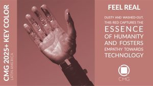
The region’s rich cultural diversity and the quest for self-knowledge influence a direction where colors are soft, subdued and tinted, reflecting a journey toward personal growth and flexibility. Feel Real, a low-chroma, yellow-cast red, serves as the Key Color, symbolising the delicate balance between humanity and technology and urging a return to authenticity in an increasingly digital world.
Environmental concerns are also a significant theme. Inspired by the integration of technology with sustainable methods, the forecast discards traditional intense colours in favor of softer, ethereal neutrals. Near-black, purple, symbolising oppressive forces being cast aside, also features prominently in the forecast, reflecting a journey toward self-expression and authenticity.
North America – A paradigm reimagined
North America’s colour direction embraces contrasts — both in colour and in the storylines that shape them. The region’s forecast balances high white or high black content with less vibrant hues, reflecting a complex emotional landscape driven by technological advancements and societal shifts.
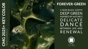
The region’s response to global challenges is captured in the forecast, offering solace within controlled connections and community building. Tinted neutrals alongside luminous, digitally inspired colours like Forever-green—a near-black, green—symbolise the duality of seeking calmness while navigating the uncertainties of a tech-driven outlook.
Climate change and environmental concerns inspire colours from nature’s ability to heal and regenerate. A balance of warm and cool tones reflects a harmonious coexistence with the natural world, even as the specter of artificial intelligence looms large.
The parallels between the Industrial Revolution and the current AI-driven era imbue the forecast with deep, quasi-black shades that remind us of the need for ethical innovation and responsible technology.
Convergence and divergence
CMG’s World Color Forecast reveals interconnected yet distinct narratives shaping colour direction across these four geographical regions.
Green is expected to play a significant role across all regions, symbolising a connection to nature and a commitment to sustainability. Whether it’s the deep, near-black, green of North America’s Forever-green or the vibrant lime green of Asia Pacific, green hues are central to the global colour direction, representing a shared concern for the climate and the desire to integrate nature into our lives.
The impact of technology is a unifying theme, with each region incorporating colours that mirror the digital world. From the indigo of Europe’s Essence to the near-black of North America, these hues convey the complexities of our relationship with technology.
Despite these shared global themes, each region’s colour forecast retains a distinct identity. Asia Pacific’s embrace of vibrant red and orange reflects its focus on connection and inclusivity, while Latin America’s softer, tinted neutrals speak to a journey of self-discovery and adaptability. Europe’s blend of deep, rich colours with neutrals exhibits its duality of tradition and innovation, while North America’s contrasts highlight its ongoing dialogue with technological advancement.
Migration and cultural blending have a more pronounced influence in Europe, where the influx of colours from Latin America, the Middle East and Africa adds warmth and diversity to the forecast. In contrast, Latin America’s colour direction is more introspective, reflecting the region’s focus on personal growth and resilience in the face of socio-economic challenges.
2025+ Key Colors
The Key Colors for 2025 and beyond encapsulate the regional and collective aspirations, challenges and transformations. Each hue is not only a visual representation, but a narrative knotted to cultural, environmental and societal shifts, defining the evolving climate of their respective regions.

Explore, the Key Color for Asia Pacific, is a low-chroma, rich, warm near-black, red, subtly touched with blue. This colour speaks to the region’s deepening commitment to sustainability, symbolising the blending of recycled materials and an environmentally conscious approach to living. Beyond its physical attributes, Explore embodies a meditative state, encouraging introspection and self-discovery. In a world driven by speed and innovation, Explore invites a pause, offering a moment to reconnect with oneself, encourage creativity and find advanced solutions through a mindful approach. Its dark richness implies the quiet yet powerful journey toward better living and meaningful experiences.
 In Europe, Essence emerges as an enigmatic, medium-chroma, indigo blue that captures a balance between brightness and chromatic intensity. This colour’s vibrant red undertones attach the past to the future, inducing nostalgia while signaling the endless possibilities ahead. Essence is a symbol of purity, strength and resilience, capturing the spirit of progress with calm determination. It resonates with the present moment, urging a renewed sense of purpose and encouraging us to embrace the here and now.
 Latin America’s Key Color, Feel Real, is a low-chroma, yellow-cast red, symbolising where humanity intersects with technology. This colour embodies the raw, authentic human experience —acknowledging vulnerabilities, mistakes and the dynamic nature of life. Evolving from more vibrant reds, Feel Real carries a dusty warmth suggestive of handcrafted clay objects like ceramics and bricks, symbols of the artistry and tradition inherent in the region’s culture. It is a colour of comprehensiveness, going above boundaries of age, background and culture, making it an emblem of multiculturalism and the human condition.
 In North America, Forever-green stands as an enduring and powerful Key Color. This yellow-cast, deep green, bordering on near-black, is rooted in nature and the cycle of life and renewal. Drawing inspiration from the earth’s mineral-rich deposits and the regenerative power of nature, Forever-green symbolises strength and the readiness for new beginnings. As global consciousness shifts towards climate protection, this colour becomes a symbol of unity and transformation, representing the harmonious relationship with nature that is essential for future prosperity.
The spirit of 2025+ – An international colour narrative
As we look ahead to 2025 and beyond, CMG’s World Color Forecast tells a story of interconnection, willingness to change and to improve. Each region’s forecast mirrors its unique journey, yet they all share a common thread—a commitment to embracing the complexities of our world, whether through a deeper link to nature, thoughtful integration of technology, or renewed focus on eco-friendly practices. The colour forecast is not just an anthology of hues on a spectrum; it is a guiding direction, providing colour professionals with insight as they prepare for future product and service designs.
Understanding future consumer colour preferences empowers organisations to manage their colour portfolios, supply chains and inventories effectively. CMG’s World Color Forecast is a member benefit, and detailed colour information is not shared with the general public.
Montaha Hidefi, Color Archaeologist™ and founder of Color Landing Studio; VP of Color Forecasting at Color Marketing Group™; VP at Colour Research Society of Canada; Color Consultant at The ChemQuest Group.
All images courtesy of Color Marketing Group.


